Introduction
In Kenya, the smartphone is the primary gateway to the internet. Over 80% of internet access happens via mobile devices, and for many Kenyans, their phone is their only computing device. This reality has profound implications for how websites must be designed and built.
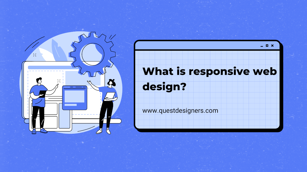
Responsive web design is the practice of building websites that automatically adapt their layout, images, and functionality to work perfectly on any screen size, from the smallest smartphone to the largest desktop monitor. It's not a luxury feature; it's a fundamental requirement for any business that wants to succeed online in Kenya.
The Mobile Reality in Kenya
Let's look at the numbers that make responsive design non-negotiable for Kenyan businesses. Kenya has over 30 million mobile internet subscribers. The average Kenyan spends 3+ hours per day on their smartphone. 67% of Kenyans discover new businesses through mobile search. Mobile e-commerce transactions grew by 45% in 2025. Google uses mobile-first indexing, meaning your mobile site determines your search rankings.
These aren't just statistics; they represent real potential customers who will bounce from your site if it doesn't work on their phone. If your website isn't responsive, you're invisible to the majority of your market.
"If your website doesn't work on mobile, you don't have a website. You have a digital liability that's actively turning away customers every single day."
Key Elements of Responsive Design
Responsive design encompasses several technical and design principles that work together to create a seamless experience across devices.
Fluid grids use percentage-based widths instead of fixed pixel widths, allowing content to expand and contract with the screen size. Flexible images scale within their containers and are served in appropriate sizes to avoid downloading unnecessarily large files on mobile devices. Media queries apply different CSS styles based on the device's screen width, allowing you to rearrange layouts, resize text, and show or hide elements as needed.
Touch-friendly interfaces are essential. Buttons and links must be large enough to tap with a finger (minimum 44x44 pixels), forms must work well with mobile keyboards, and navigation must be accessible through a mobile-friendly menu. Readable typography means using a base font size of at least 16px, sufficient line height, and adequate contrast for outdoor viewing on bright screens.
/* Responsive grid using CSS Grid */
.service-grid {
  display: grid;
  gap: 1.5rem;
  grid-template-columns: 1fr; /* Single column on mobile */
}

@media (min-width: 640px) {
  .service-grid {
    grid-template-columns: repeat(2, 1fr); /* 2 columns on tablet */
  }
}

@media (min-width: 1024px) {
  .service-grid {
    grid-template-columns: repeat(3, 1fr); /* 3 columns on desktop */
  }
}

/* Touch-friendly button sizing */
.cta-button {
  min-height: 48px;
  padding: 12px 24px;
  font-size: 1rem;
}
Performance on Mobile Networks
Responsive design isn't just about layout; it's about performance. Mobile users in Kenya often operate on slower connections, and every extra kilobyte increases load time. A responsive website must be optimized for mobile network conditions.
Serve appropriately sized images using the srcset attribute so mobile devices download smaller images. Minimize CSS and JavaScript payloads. Use lazy loading for images below the fold. Consider using a service worker for offline functionality, especially useful when Kenyan users move between areas with varying connectivity.
Performance Target
Testing Your Responsive Design
Building a responsive website isn't complete until you've tested it thoroughly across real devices and browsers. Don't rely solely on browser developer tools; they simulate responsive behavior but can miss real-world issues like touch behavior, scroll performance, and font rendering differences.
At minimum, test on the most popular devices in Kenya: the Samsung Galaxy series (most popular Android phones), Tecno and Infinix devices (popular budget smartphones), iPhones (growing market share in urban areas), and tablets of various sizes. Test critical user journeys like navigating to your contact page, filling out a form, making a purchase, and reading a blog article.
Conclusion
Responsive web design is the bare minimum for doing business online in Kenya. With the vast majority of your potential customers accessing the internet via smartphones, a website that doesn't work perfectly on mobile is a website that's failing your business.
If your current website isn't responsive, prioritize a redesign immediately. Every day you wait is a day you're losing potential customers to competitors with mobile-friendly websites. The investment in responsive design pays for itself through improved user experience, better search rankings, higher conversion rates, and increased customer satisfaction.